Graphic Design Trends 2026
Design in 2026 is moving back towards the human hand. After a few years of clean, machine-made polish, the mood has shifted, and a lot of that is down to AI. When anyone can generate a tidy, generic visual in seconds, the work that stands out is the work that obviously has a person behind it: visible texture, a bit of imperfection, warmth and craft. Most of the trends below come from that same design philosophy.
At Ashley House, we design, consult and print under one roof here in Exeter, so we see these trends from both sides, how they look on screen and how they behave once they are on paper. Here are the graphic design trends we think are worth your attention in 2026, with a note on each for producing it in print, and keeping it sustainable.
Trends covered in this article:
- Human, handmade and imperfect
- Tactile and textured design
- Expressive, oversized typography
- Folk and nature-inspired design
- Maximalism and controlled chaos
- Frutiger Aero and the Y2K revival
- Surreal, dreamlike imagery
- Candid, unpolished photography
- Bold, saturated colour
- Utilitarian and micro-industrial design
- Sustainability
- Trends to print
- Frequently asked questions
1. Human, handmade and imperfect
This is the defining mood of the year. Hand-drawn marks, visible brushwork, wobbly lines and the odd deliberate mistake left in. After a decade of pixel-perfect minimalism, brands want to look like real people made them. Part of that is a reaction to AI work, which tends to come out smooth and generic, and part of it is simply a return to character.
This is the trend print was built for. Uncoated and cotton stocks carry a handmade feel that a screen can only imitate, and they take ink with a softness that suits hand-drawn work. Around 75% of our brochures now run on uncoated stock, a positive choice for how it feels in the hand rather than a budget one. For a true craft finish, litho on a textured stock or a short run on our HP Indigo 7900 both work well, depending on quantity.
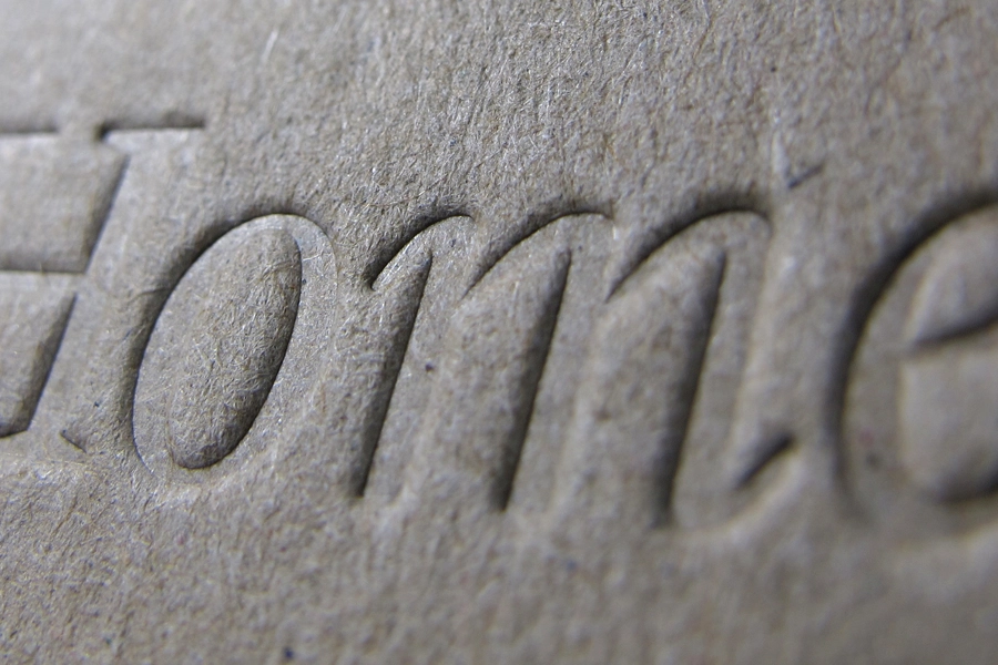
2. Tactile and textured design
Closely related to the handmade look, but this one is about the surface rather than the mark. Designers are recreating the feel of touch on screen, with puffy, soft, rubbery, three-dimensional textures that ask to be held. The catch is that a screen cannot deliver the one thing the trend is actually about.
Print gives you the real thing instead of a picture of it: emboss and deboss, soft-touch lamination, spot UV varnish, foiling and textured stocks. A soft-touch laminate with a raised spot UV detail, for example, gives a genuine change in feel across a single surface.
A soft-touch or laminated finish can affect how easily a piece is recycled, so where that matters we will suggest an unlaminated textured stock, or an emboss that needs no film at all. There is nearly always a way to get the effect and keep the piece recyclable.
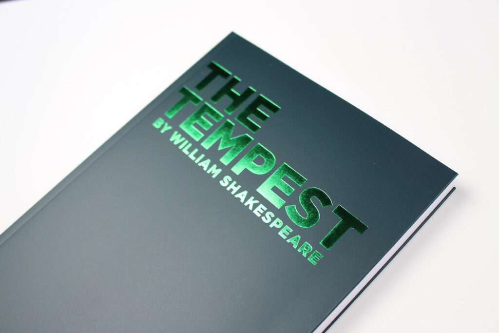
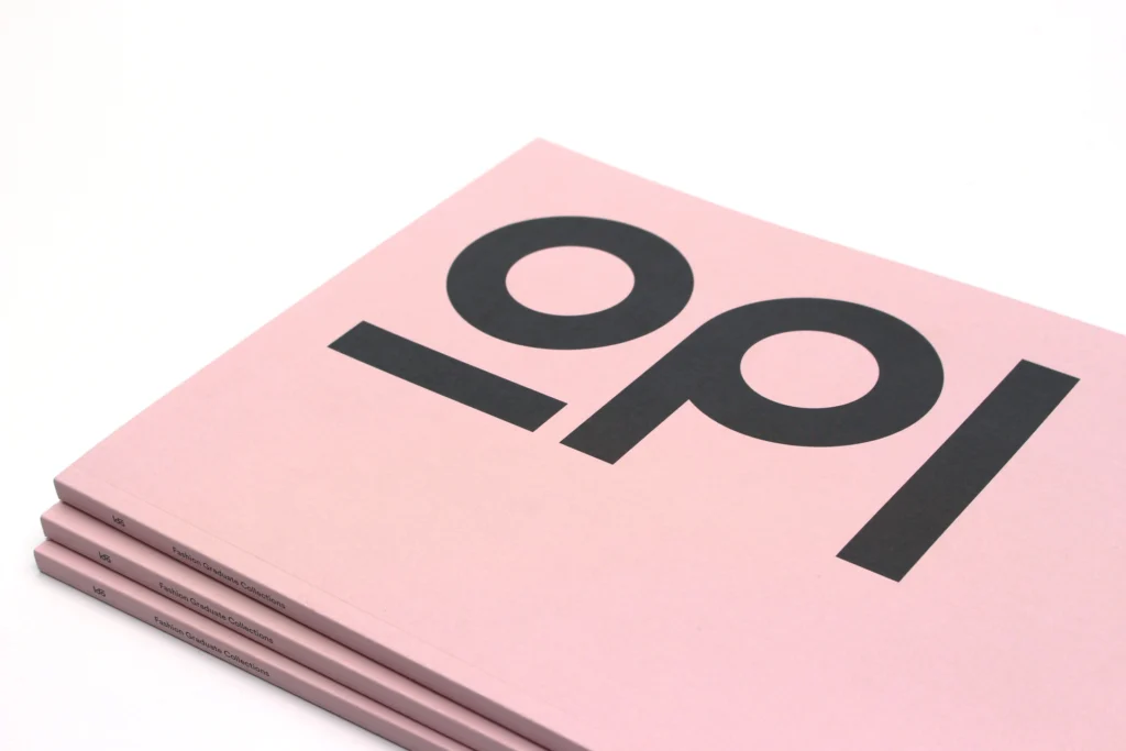
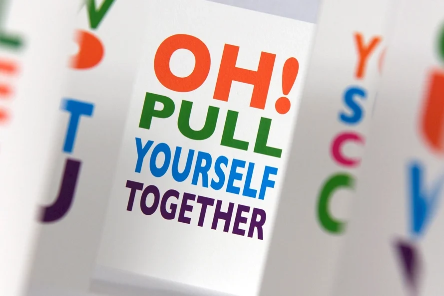
3. Expressive, oversized typography
Here the type is the design, not a label sitting on top of it. Huge headlines, custom letterforms, characters that bleed off the edge and carry the personality on their own. With imagery starting to feel synthetic, words are doing more of the brand work this year.
Big type is the natural place to add a finish. Set a headline large and it becomes the obvious spot for foiling, spot UV or an emboss, so the lettering catches the light and lifts off the page.
Heavier cover stocks hold a large format without showing handling marks, and litho on our Heidelberg Speedmaster presses gives clean, sharp edges on solid letterforms at scale. For covers and large-format work, it is one of the most cost-effective ways to make a piece feel considered.
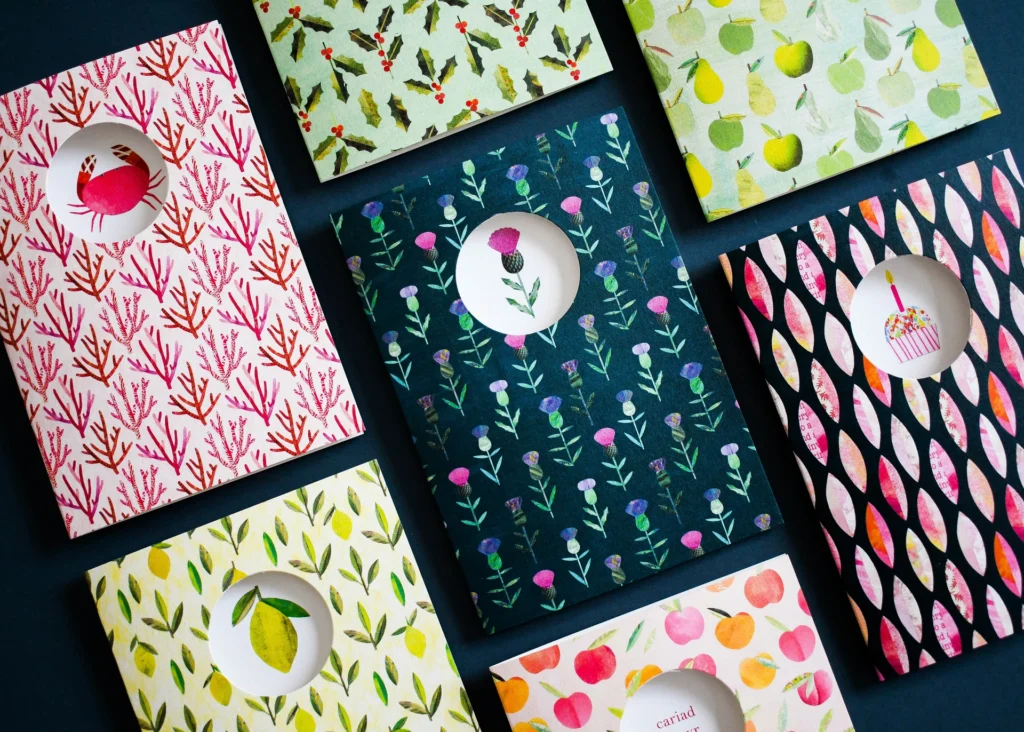
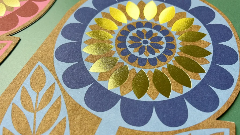
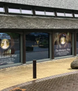
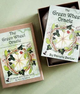
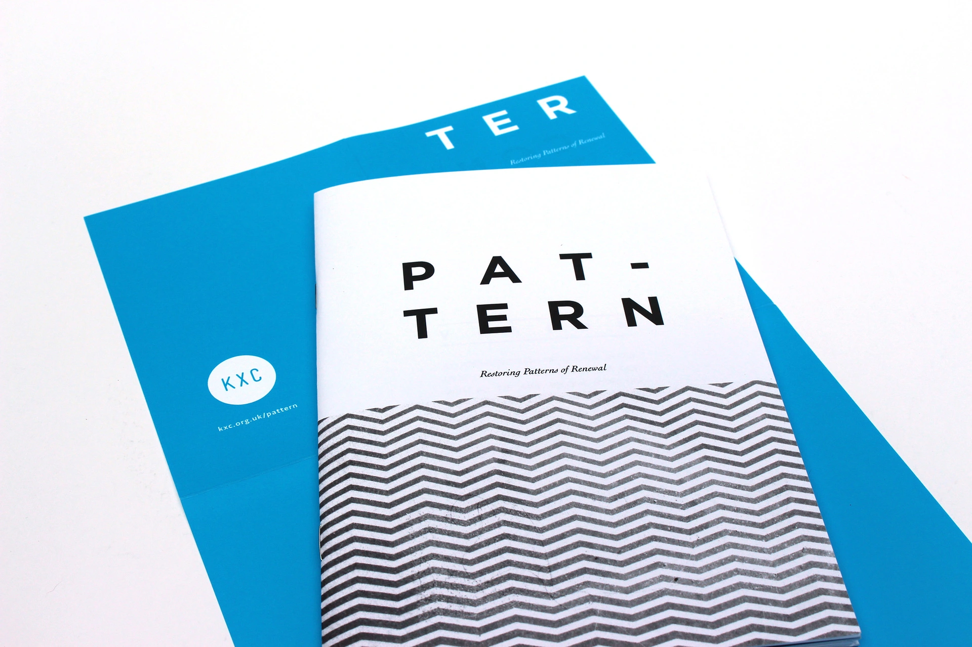
4. Folk and nature-inspired design
A slower, warmer style rooted in heritage and craft. This style includes folk motifs, regional patterns, botanical illustration and earthy palettes, brought into clean modern layouts. It feels grounded and human, which is precisely the theme of the year.
This is a look where the paper needs to agree with the design. Recycled and kraft stocks, uncoated finishes and warm naturals all suit it, where a glossy coated sheet would work against it.
Our vegetable-based inks sit beautifully on these papers and every stock we use is FSC certified. On this trend, the greener choice and the better-looking choice tend to be the same one.
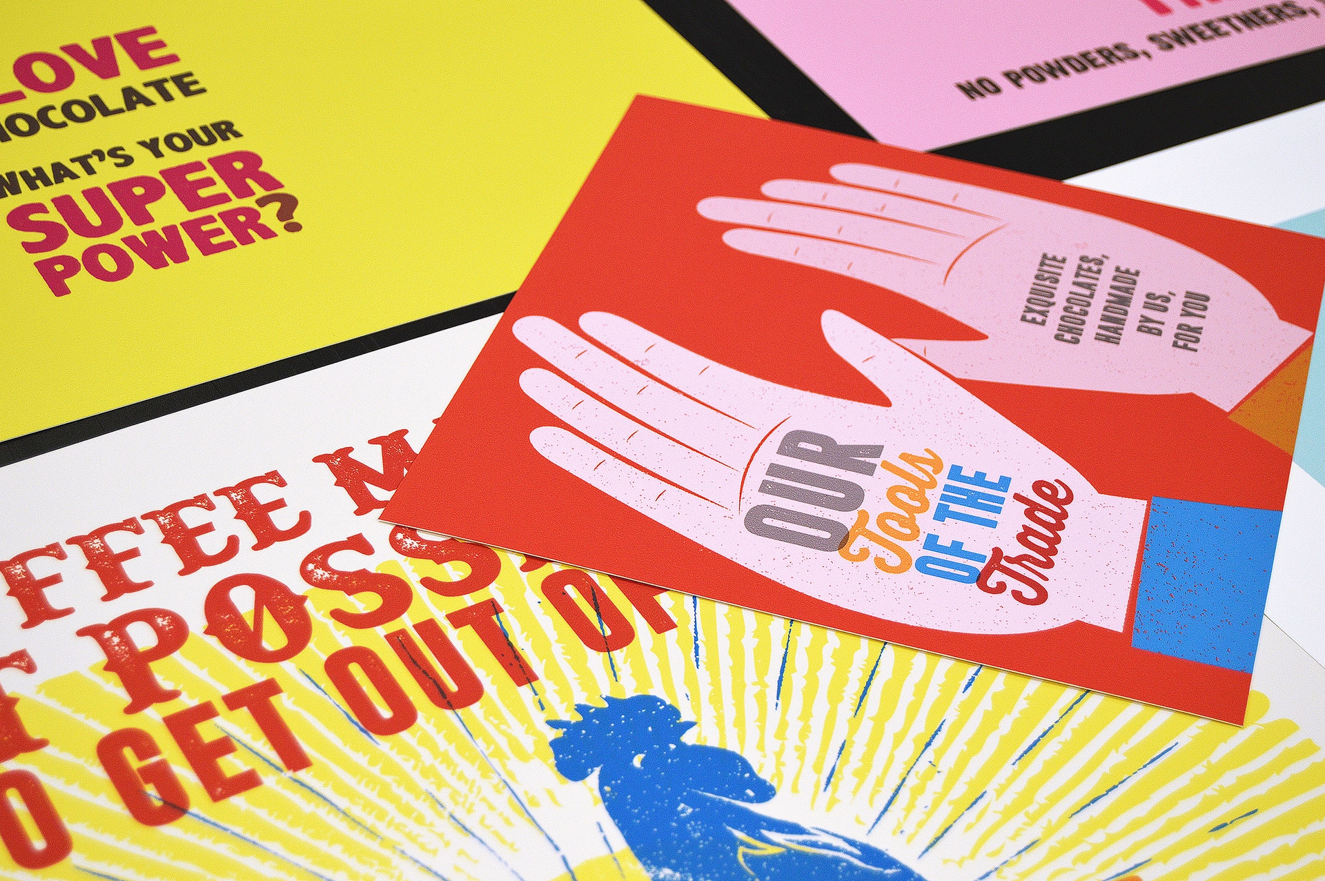
5. Maximalism and controlled chaos
Maximalism is back with dense layers, clashing colour, busy patterns and a sense of joyful overload, held together by a designer who knows exactly which rules they are breaking. It is a creative push back against safe, sparse corporate design.
With heavy ink coverage and rich colour, production matters as much as the design. Litho gives the colour fidelity and consistency that dense work needs across a long run, and we will advise on ink coverage, drying and stock weight so a busy layout stays crisp rather than muddy.
Where a design uses colours outside the standard range, we can bring in Pantone special colours to keep them true.
6. Frutiger Aero and the Y2K revival
Early-2000s techno-optimism is also back with its glossy bubbles, skies and water, lush gradients and a hopeful digital sheen. It is a nostalgic answer to the flat, sterile look that ran the last decade.
Gradients are the thing to get right here. Screen gradients live in RGB and can band or shift when they are converted for print, so we set them up in CMYK and proof them properly before the run.
A gloss or silk coated stock holds the bright, optimistic feel the trend depends on, and a gloss laminate or spot UV can push the sheen further. The Y2K look on paper really does come down to careful proofing, which is where we start.
7. Surreal, dreamlike imagery
Strange, beautiful, slightly impossible visuals: melting forms, odd scale, dream logic. AI is often part of the toolkit here, but the work produced is properly art-directed, with a person deciding what is actually interesting.
With surreal imagery, reproduction is everything. Rich, detailed images hold best on coated stocks, and our HP Indigo 7900 gives vivid, consistent colour on short runs, which suits image-led pieces and limited editions. For gallery-quality work we match the stock and finish to the image, not the other way round.
8. Candid, unpolished photography
Grainy, off-the-cuff, phone-camera photography that feels like a moment rather than a set-up shoot. It is the photographic side of the same human, anti-AI mood, and it earns trust because it looks unfiltered.
Grain and natural tones usually suit an uncoated or matt finish, which softens the image and leans into the unpolished feel, where a high gloss can work against it. We will talk through coated versus uncoated for your images, because the right call depends on whether you want the photography to feel raw or to stand out on the page.
9. Bold, saturated colour
Confident, high-energy palettes: electric brights, neons and saturated blocks used boldly. Colour is a quick way to get noticed, and 2026 is not a year for playing it safe.
The brightest screen colours often sit outside what standard four-colour printing can reproduce, so the most saturated brights and neons are where Pantone and fluorescent special colours earn their place.
On darker designs, foil creates a striking metallic finish that simply can’t be achieved with ink alone. Our team can advise which colours will reproduce accurately and where a specialist foil or spot colour may be needed, ensuring your artwork looks exactly as intended before it goes to print.
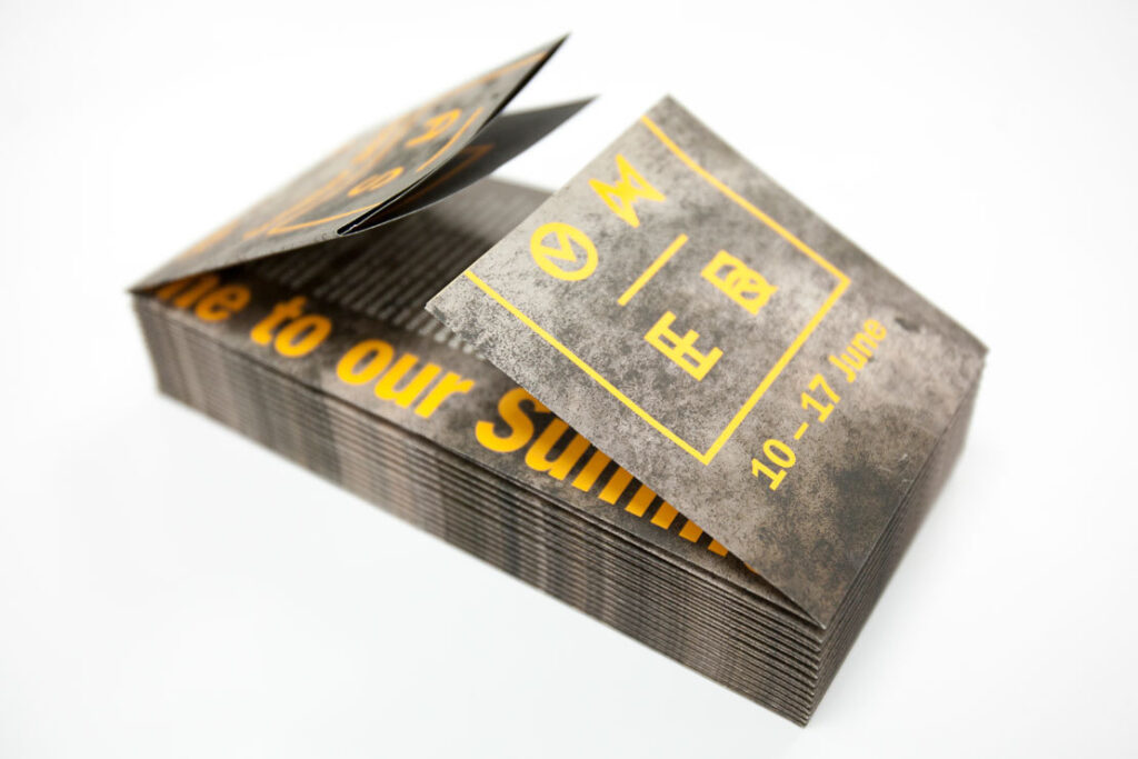
10. Utilitarian and micro-industrial design
A cooler, functional aesthetic: mono fonts, technical marks, barcodes, registration ticks and regulatory details used as decoration. It borrows the language of the factory and spec sheet, then makes it look intentional.
This one crosses over into production more than most. The finishing becomes part of the design: die-cutting, kiss-cutting, perforation and labels, while variable details like codes or numbering can be printed individually on the HP Indigo, which is ideal for short runs where each piece needs to differ.
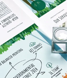
11. Sustainability
Sustainability is not really a trend of its own in 2026. It runs through the other ten. The earthy, tactile direction of this year’s design happens to line up with genuinely responsible production, but the two do not come as a pair automatically. Some on-trend finishes, certain laminates and foils, can make a piece harder to recycle.
We are a Carbon Balanced Printer through the World Land Trust, FSC certified and ISO 14001 accredited. We run on 100% green energy, use vegetable-based inks, operate a zero landfill policy, and have carbon balanced our paper as standard since 2014, at no extra cost to our customers. So when a trend calls for a particular look, we can show you how to get it while keeping the piece recyclable, and where a finish carries an environmental cost, we will offer an alternative that does not.
Trends to print
A fast way to see each trend, the print route that suits it, and the one eco point to keep in mind.
| Trend | Print route | Eco note |
| Human, handmade and imperfect | Uncoated or cotton stock; litho on textured stock or a short run on the HP Indigo | Low impact by default; uncoated and FSC as standard |
| Tactile and textured | Emboss and deboss, soft-touch lamination, spot UV, foiling, textured stock | Laminates and foils can affect recycling; emboss or an unlaminated stock keeps it recyclable |
| Expressive, oversized type | Foiling, spot UV or emboss on heavy cover stock; litho on the Heidelberg Speedmaster | Foil affects recycling; emboss is the film-free route |
| Folk and nature-inspired | Recycled, kraft and uncoated stocks; vegetable-based inks | Greener and better-looking align; FSC stock throughout |
| Maximalism and controlled chaos | Litho for colour consistency across long runs; Pantone specials | Heavy ink coverage; standard recyclable stocks |
| Frutiger Aero and Y2K | Gloss or silk coated stock; CMYK gradient setup and proofing; gloss laminate or spot UV | Gloss laminate affects recycling; ask about a UV or uncoated alternative |
| Surreal, dreamlike imagery | Coated stock; HP Indigo 7900 for short runs and limited editions | Standard coated stock is recyclable; go easy on heavy lamination |
| Candid, unpolished photography | Uncoated or matt finish | Low impact by default; uncoated and FSC |
| Bold, saturated colour | Pantone and fluorescent specials; foil on dark designs | Foil affects recycling; specials over laminate where you can |
| Utilitarian and micro-industrial | Die-cutting, kiss-cutting, perforation and labels; variable data on the HP Indigo | Mostly recyclable; check any adhesive labels |
Frequently Asked Questions
-
The clearest theme is a move back towards the human and handmade: visible craft, tactile texture, expressive typography and warm, imperfect work, all in reaction to a wave of AI-generated design. Bold colour, maximalism and an early-2000s digital revival are part of the same confident, character-led mood.
-
Yes. As more visual content gets generated automatically, the value of considered, human design has gone up rather than down. Brands that want to stand out are investing in design with a point of view, and in production that makes it tangible, which is where printed work comes in.
-
Flat, sterile minimalism, over-filtered stock photography and the smooth, generic look of default AI output are all fading. The reaction against them is what is driving this year’s warmer, more tactile direction.
-
To feel human and trustworthy. The work that succeeds connects emotionally, shows a human hand, and carries the brand’s character instead of blending into the feed.
-
Nearly all of them have a natural home in print, from emboss and soft-touch finishes for tactile work to foil and special colours for bold type and colour. Most can be produced with full environmental credentials on recycled, FSC certified stock with vegetable-based inks.
A few finishes, such as some laminates and foils, can affect recyclability, and we will always suggest a route to the look that keeps the piece recyclable.
Whether you’re creating luxury packaging, premium marketing materials or a standout publication, the right combination of paper, print and finishing can make all the difference.