How to Set Up a Brochure for Printing
Setting up a brochure for print is as much about preparation as design. Get the format, artwork and paper right before the file reaches us and the press does the rest. These are the details that decide how a brochure prints, and they are far easier to settle before the file goes on press than to fix at the proof stage.
This guide covers the decisions that matter at each stage: choosing a format and fold, planning the layout, preparing print-ready artwork, picking paper and finishing, and keeping the cost down. It is written from years of first-hand experience with brochure printing in the UK, so it is the same advice we give our clients before a brochure goes on press.
Whether you are a marketing manager, an in-house designer or an independent publisher, the aim is the same: a file that prints exactly as you intended, first time.
Key points
- Start with the brochure’s job and audience, then let that drive the format and fold.
- Match format, fold and binding to the content and the budget, not the other way round.
- Build the layout for readability first: clear hierarchy, even spacing, purposeful images.
- Specify sustainable stock and inks. We print carbon balanced as standard.
- Supply a print-ready PDF: 300 dpi images, 3mm bleed, CMYK, fonts embedded.
Understanding your brochure’s purpose and audience
A brochure that achieves its business objectives starts with a clear purpose and a defined reader. Are you launching a product, introducing a service, or giving a brand something physical to hand over? The objective shapes the format, the length and the tone.
Before you design anything, decide who will read the brochure and what you want them to do next. When the format and content match what that reader expects, the brochure works harder and you waste less budget getting there.
Identifying goals before you design
Start with what you want the reader to do after they put the brochure down: visit a website, call, request a quote, or simply think differently about your brand. That single decision shapes everything else.
It also points to the format. A tri-fold suits a step-by-step introduction; a landscape format suits image-led work like a portfolio or a product range. Match the structure to the journey you want the reader to take.
The audience changes the brief too. An SME marketing manager often wants concise, practical information. A designer or independent publisher is more likely to want premium stock and finishing. Neither is wrong; they are different briefs.
Sustainability increasingly sits in that brief. More buyers ask about it directly, and for many it now affects the decision. We print carbon balanced as standard, at no extra cost, so the environmental side is covered without you having to specify it. More on that below.
Choosing the right brochure format and fold
Format and fold affect how the reader handles the brochure, how the content flows and what it costs to produce. Half fold, tri-fold, z-fold, c-fold or something bespoke: each changes the look, the feel and the budget. With the goal and audience clear, this stage is about matching the format to the content without paying for complexity you do not need.
Comparing standard and bespoke options
Standard folds, the half fold, tri-fold, z-fold and c-fold, are popular for good reason: they’re familiar, cost-effective and cover most brochure needs.
The tri-fold is often a great choice; it divides the page into three panels that lead the reader from headline to call to action in a logical sequence. It is easy to handle, post and slot into a wider marketing pack, which is why it is a safe default for many SMEs.
Bespoke formats earn their place when the piece needs to stand out and be kept. A concertina fold, a gatefold or a custom square format can tell a story more dynamically and reinforce brand identity. The trade-off is cost and time: bespoke work means extra setup, hand folding and sometimes die-cutting, so factor that into both budget and timeline.
Link the choice back to how the brochure will be used. A fold that confuses the reader, or a format that complicates posting, undermines the whole piece. We work clients through this with real samples, suggest the format that suits the content, and flag issues like image placement across folds or loss into the gutter before they become problems. A simple half fold or tri-fold often does the job; a bespoke fold is worth the extra only when it adds something the reader will notice.
The right choice should reveal the content in the right order and feel natural in the hand. Get that right and the format sets up cleanly for layout and print.
Key principles of effective brochure layout
With the goal and format set, the layout is where design and print expertise meet. A good layout pairs visual appeal with a logical structure, so the reader moves through the content without friction.
Balancing structure, readability and visual flow
Sketch the content structure before you design. If the content jumps around, no amount of imagery will rescue it. Divide the brochure into logical sections that follow your core message, and use headings, columns and consistent spacing to keep the reader oriented. Hierarchy does a lot of the work: prominent headings introduce each topic, subheads guide the journey, and body text stays legible rather than dense.
Readability underpins everything. Choose type sizes and styles that suit the audience, and balance white space with content. Heavy blocks of text tire the reader; too much white space dilutes the message. Generous margins, comfortable line lengths and consistent spacing let the eye move easily from one point to the next.
Make every visual choice serve the content. Imagery and graphics should be placed with purpose, to break up copy, reinforce the brand or highlight a call to action, never just to fill space. Use grids or guides, particularly on multi-panel brochures, so alignment and rhythm hold across panels and pages.
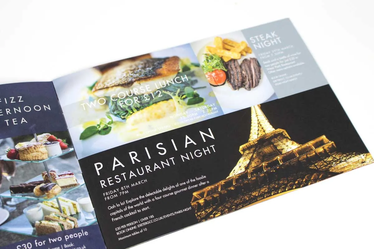
Consistency from cover to back panel reads as professionalism. Check alignment, and make sure design elements respect the trim and fold lines, because misalignment undermines even the strongest content. Working with your printer, you can preview how the layout will behave in print and catch issues before they cost you. For more on this, see our bespoke brochure printing options.
Selecting design elements that work in print
Once the structure is set, the detail does the talking: colour, imagery and typography. These shape first impressions and brand recall, and they behave differently in print than on screen, so each choice needs to be deliberate.
How colour, imagery and typography influence results
Colour does more than decorate. It sets mood, reinforces brand identity and guides the reader. Choose your palette for how it will look on paper, not on screen: ink absorption, paper finish and lighting all shift the result. Keep colour consistent for brand coherence, and use bold secondary colours sparingly to flag key information or calls to action. We always recommend reviewing a hard copy proof to see how your colours actually translate before the full run.
Imagery has to earn its place and must be high resolution (300 dpi at actual print size); grainy or pixelated images undo the rest of your work. Match the image to the message, product shots for a catalogue, people for a service brochure, and check that key elements are not lost in folds, gutters or trim.
Typography subtly controls how easily the content reads. Small type, clashing fonts or too many styles make for tiring reading. Keep it clear and consistent, use no more than two or three font families, and remember that some fonts look different in print than on screen. Watch weight, size and contrast, and keep type away from folds and edges where it can distort or be lost.
The three should complement, not compete with each other. When colour, imagery and typography work together, the page is cohesive. Bring your printer in early so the design is technically sound as well as visually strong; we can advise on everything from ink limits to how a particular stock behaves.
Rich black is a good example of an ink limit worth getting right. Pure 100% black can look flat, so we blend in cyan, magenta and yellow to deepen it, while keeping total ink coverage within press limits (around 280 to 300%) so the ink dries cleanly and does not smudge. A balanced rich black such as 20% C, 20% M, 20% Y, 100% K gives a dark, saturated result without exceeding those limits. We will advise on the right formula for your stock.
Making sustainable choices in materials and processes
Modern brochure print is about responsible choices as well as how the piece looks and feels. The paper, inks and production methods you choose protect the environment and signal your brand’s values. We hold print quality and environmental responsibility together rather than trading one for the other.
Eco-friendly paper, inks and carbon balanced printing
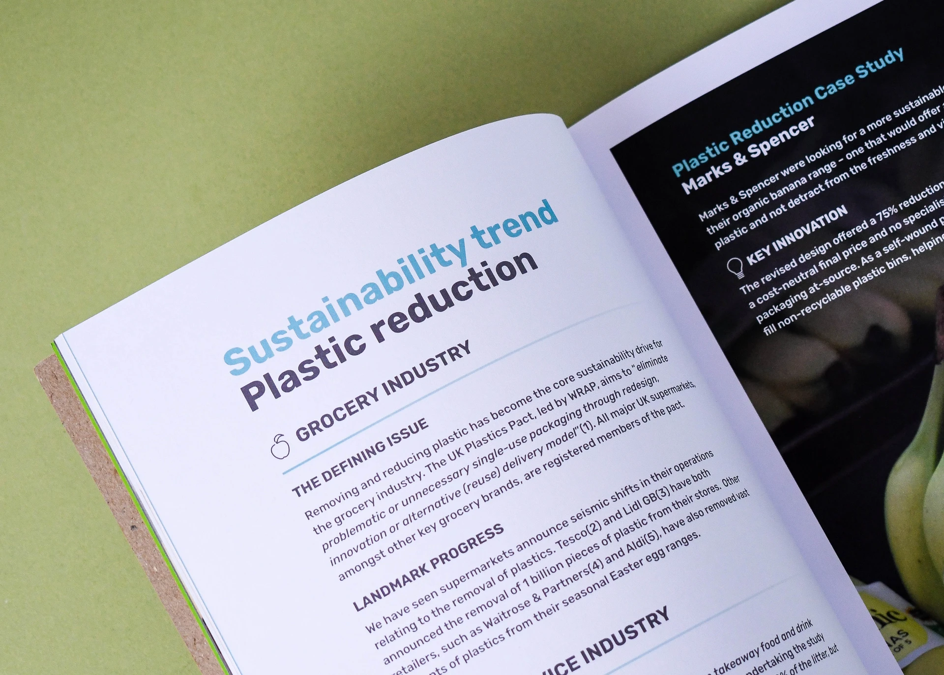
Eco-friendly print starts with the stock. Around 75% of the brochures we produce now print on uncoated paper: it is a capable, popular choice rather than a compromise, and it suits most brochures well. Coated stock, silk or gloss, remains the traditional choice for image-led work that needs maximum punch from photography. Recycled stock comes in both. Whichever you choose, all the paper we use is FSC® certified and responsibly sourced, so the sustainability claim holds up.
Ink matters as much as paper. We use vegetable-based inks, which typically release lower VOCs than oil-based alternatives and work well on both coated and uncoated stock. You get crisp detail and strong colour without the environmental cost of petroleum-based inks. Where colour accuracy is critical, a catalogue for instance, we tune the setup for the specific paper and ink so results stay consistent.
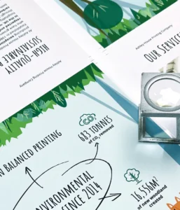
Credibility comes from more than paper and ink. We are a certified Carbon Balanced Printer through the World Land Trust: the carbon impact of production is balanced by protecting and restoring threatened habitat through the World Land Trust scheme. We also run on 100% green energy, operate a zero landfill policy and use plastic-free packaging, and we have printed on carbon balanced paper as standard since 2014, at no extra cost to you. If sustainability is part of your brief, you can display these credentials on the finished brochure, which increasingly matters to procurement teams and eco-conscious buyers.
Sustainable print does not mean compromising on quality or ambition. You can still specify bespoke folds, special finishes and ambitious design on eco-friendly stock. Some recycled stocks absorb ink differently, so we adjust artwork setup and press settings to keep your visuals sharp. The result is a finished piece that reflects both your brand and its environmental standards.
Setting up print-ready files for professional output
With the format, layout and design settled, the last step before production is turning your design into a print-ready file. This is where technical detail separates a clean print from a costly mistake. Get resolution, bleed and export right and the brochure prints as intended.
Resolution, bleed and export, and how to avoid print issues
Set all imagery and graphics to 300 dpi at print size. This keeps every photo and illustration sharp on press and avoids the pixelation you get from screen-resolution images (typically 72 dpi). Images are easy to downscale during design tweaks, so check your final export.
Include a minimum 3mm bleed on all sides. Bleed is the extra area beyond the trim that allows for movement when the brochure is cut. Without it you risk thin white strips or unwanted cropping at the edge. We review client artwork for bleed as a matter of course and advise on trim and safe zones.
For safety, keep important text and logos at least 3 to 5mm inside the trim. This safe zone means nothing vital is clipped when the brochure is cut to size.
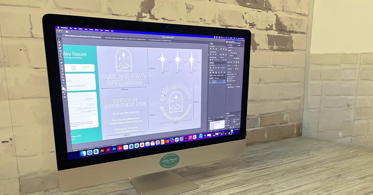
Export correctly to close the loop. Choose a “Press Quality” or “High Quality Print” PDF preset, with fonts embedded and images at 300 dpi. Wherever possible, export to PDF/X-4: it is the modern print-ready standard and preserves live transparency and colour management, so our presses reproduce your design faithfully. PDF/X-1a is the older alternative, with everything flattened and converted to CMYK and no live transparency. Both work here; PDF/X-4 gives us the most to work with.
Always convert colours to CMYK, not RGB, because presses reproduce colour in CMYK and an RGB file can shift noticeably in print. Keep all content clear of fold lines, add crop marks, and tick the bleed option in the export dialogue. If you are using special finishes such as spot UV or foiling, put them on clearly named separate layers. We are happy to supply templates and check your setup before it goes on press, so just ask.
Understanding binding, pagination and fold techniques
How the brochure is finished and assembled affects both the design and the feel of the final piece. Binding, page count and fold technique decide how the brochure reads in the hand, where key content lands, and what it costs. The right choices here lift a brochure from ordinary to one that feels properly made.
Choosing the right binding and finishing
Bound brochures are made up in multiples of four pages, because each printed sheet folds down to four. Designing to a multiple of four (8, 12, 16, 20 and so on) means you are not paying for blank pages to pad the count. If you are not sure how your content maps to a page count, send it over and we will work it back for you.
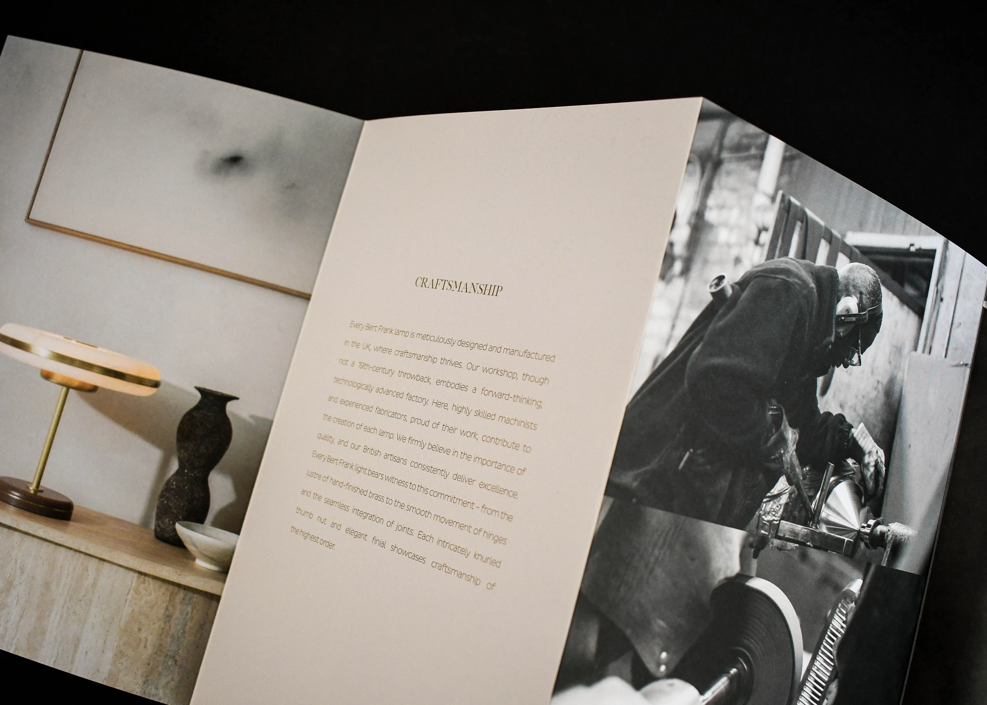
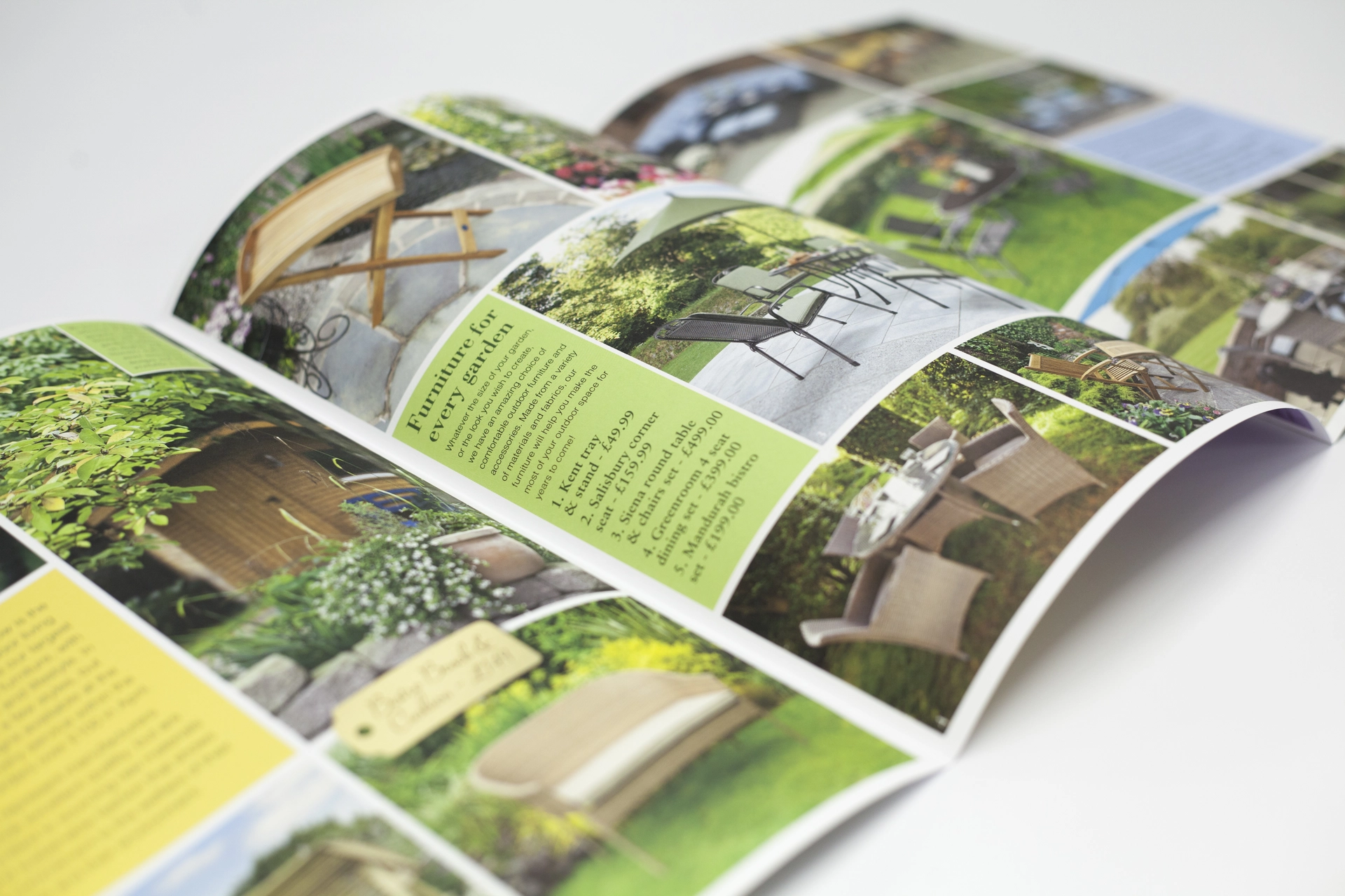
The fold frames the story and guides navigation. A tri-fold is intuitive and compact. A half fold or gatefold gives larger uninterrupted spreads for visuals or narrative. More complex concertina or cross folds reveal content in stages, so each panel becomes a moment for the reader. Folds also affect paper grain and registration, so set them up correctly to avoid misregistration or cracking, and talk to us early.
One detail on gatefolds: make the two inner gate panels slightly narrower, by a few millimetres, than the outer panels. That allowance stops the folded-in panels colliding, so the brochure closes flat.
Binding is the next decision:
- Saddle stitching (FST), stitched through the fold, suits brochures up to around 64 pages depending on paper weight. It is economical, neat and lies reasonably flat when open, which makes it the default for smaller catalogues and event programmes. On thicker work, watch for page creep: as sheets nest inside each other, the inner pages push out and can be trimmed shorter. We compensate by shifting content inward on the inner sheets so margins stay even and nothing important is lost at trim.
- Perfect binding (PUR) gives a squared spine you can print on, ideal for thicker catalogues, brochures and books. We run PUR from 2mm to 50mm thick and calculate the exact spine width from your page count and paper.
- Wiro binding is the choice when the brochure needs to lie completely flat in use, such as a manual or a reference piece.
- Singer-sewn binding stitches thread through the fold for a durable, handcrafted finish, popular for limited editions and independent publishers who want the binding to be part of the statement.
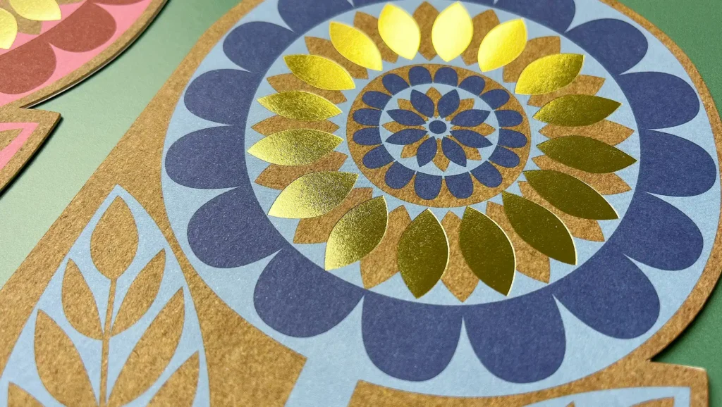
Finishing covers more than how the pages are held together. Matt, gloss and soft touch lamination, spot UV varnish, foiling and embossing all add tactile or visual impact, and they work best on covers and key touchpoints. Plan them from the outset: finishes are applied before binding and need fold, registration and artwork to line up, so tell us early and we will set the artwork up to suit.
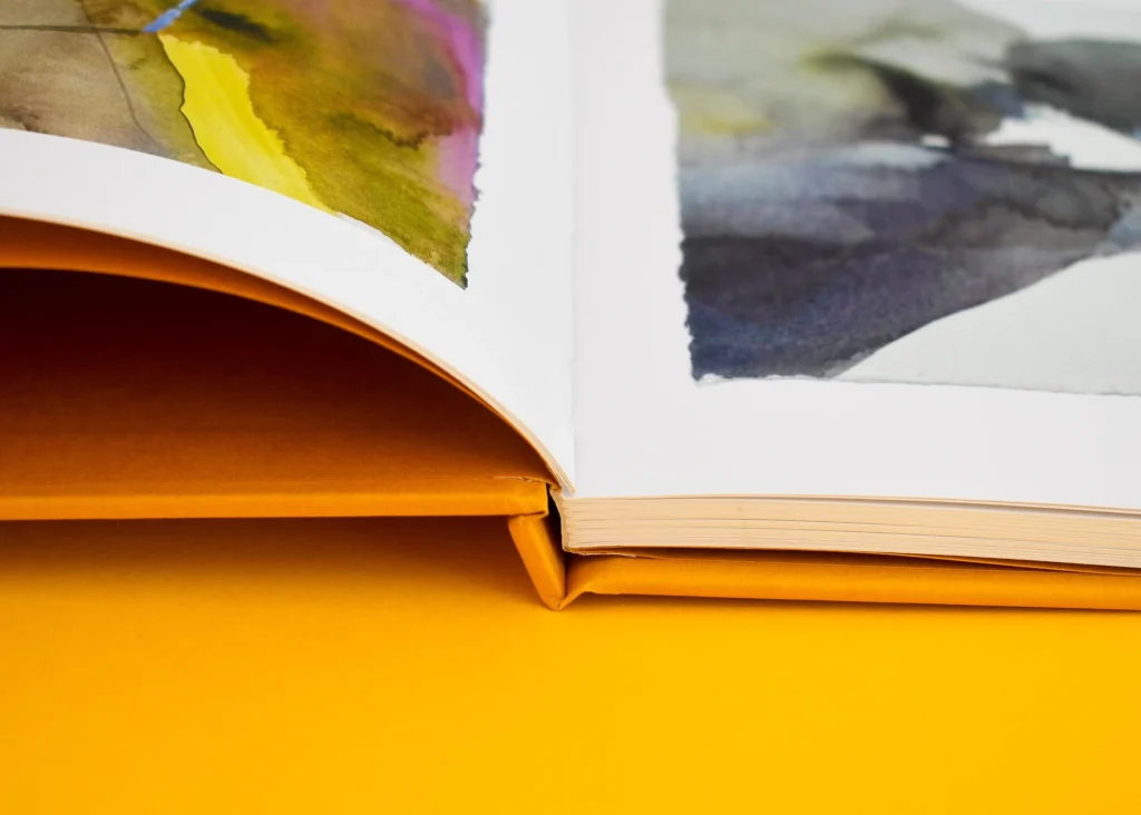
Paper choice ties all of this together, so discuss type, weight, fold orientation and finishing while the brochure is still at the flat design stage. Bulk matters as well as weight: a 170gsm high-bulk uncoated stock can feel as thick as a 200gsm standard coated sheet, which affects spine width and how many pages can be saddle stitched cleanly. We plan for both weight (gsm) and caliper (physical thickness) from the start. A heavier or high-bulk paper may need scoring to fold without cracking, and we keep the paper grain parallel to the fold wherever possible so pages turn and fold smoothly. That way your design translates into the finished piece without surprises or reprints.
The table below summarises the main binding options.
| Binding | Page range / thickness | Lies flat? | Best for |
| Saddle stitched (FST) | Up to ~64pp, paper-dependent | Reasonably | Catalogues, programmes, shorter brochures |
| Perfect bound (PUR) | 2mm to 50mm spine | No, squared spine | Thicker catalogues, brochures, books |
| Wiro bound | Wide range | Yes, fully flat | Manuals, reference and presentation pieces |
| Singer-sewn | Lower page counts | Reasonably | Limited editions, premium and creative work |
Cost drivers and how to make the most of your budget
Once format, layout and design are settled, a few factors decide the final cost: quantity, print method, proofing and how much you need the design to scale. Understanding these means your budget goes further and nothing is wasted.
Order quantities, proofs and scalability
Digital printing (our HP Indigo 7900) is the economical choice for shorter runs, up to around 500 copies, and it is ideal for testing a new design or running a targeted campaign. Litho (our Heidelberg Speedmaster presses) becomes more cost-effective above around 500, especially into the thousands, where consistency across a long run matters.
Order quantity drives unit cost: the more you print, the lower the cost per brochure. The temptation is to over-order for a lower unit price, but printing more than you will use before the content dates is a false economy. If the design is new or the content changes often, print to your real near-term need plus a small surplus.
Proofs prevent expensive mistakes. A printed proof, rather than a screen PDF, shows you the real colour, paper texture and finish, and corrections at proof stage cost a fraction of re-running a finished order. On multi-page brochures, a physical proof also lets you check pagination, binding and sequence, the kind of issues that otherwise mean a full reprint.
Build in scalability early. If the design is likely to be updated, keep the files modular so content can be swapped without a full redesign, which is useful for catalogues and regular publications. See how we handle ongoing magazine printing for an example.
Talk to us at the quoting stage. We can often combine print runs, batch finishing or adjust the spec for better rates, and we will break a quote down by element (design, quantity, finishing) so you can see exactly what drives the cost and where a small change saves money.
The genuine savings come from a handful of specific choices: a larger run, a standard format (A4, A5, A3 or 210mm square), a page count in multiples of four, standard stocks, print-ready files, and a standard turnaround rather than a rush. We are not the cheapest, and we do not try to be. The aim is good value for a brochure that is right first time.
Next steps
None of this is complicated once you know what matters at each stage. Get the format, artwork and paper right and the rest follows. If you would like a second pair of eyes on a brochure before it goes to press, send us the artwork or the brief and we will check it over. We can also supply templates for standard sizes. Contact us about brochure printing.
Frequently Asked Questions
-
Start by setting up your document at the correct page size with bleed (typically 3mm on all sides). Make sure images are high resolution (at least 300 dpi), and that text is outlined or fonts are embedded.
We recommend double-checking folds, margins and panel arrangement so the finishing is accurate, and keeping important content at least 3 to 5mm inside the trim.
-
For professional results we suggest Adobe InDesign, which has comprehensive layout and export options built for print. Adobe Illustrator is a solid alternative. Microsoft Publisher or Word can handle simple designs, but they do not manage print-specific requirements as well as dedicated design software.
We can supply templates for popular sizes if that helps.
-
Check these points before you export:
- Use CMYK colour mode, not RGB.
Include bleed (typically 3mm) on all sides. - Embed all fonts or convert text to outlines.
- Flatten transparencies, or export to PDF/X-4, which preserves live transparency.
- Supply high-resolution images, minimum 300 dpi at print size.
When exporting, choose a “Press Quality” or “High Quality Print” PDF preset. Most issues are avoided by following your printer’s file supply guidelines, and we have detailed guides for common formats.
- Use CMYK colour mode, not RGB.
-
The preferred format is PDF, which locks down fonts, images and settings for print. Make sure your file has
- Correct page dimensions with bleed.
- Single pages, not spreads, unless we have agreed otherwise.
- All fonts embedded or outlined.
- No security or password restrictions.
We accept print-ready PDFs as standard but can discuss other formats if you need to.
-
Ask us. If you are unsure about file setup, export settings or anything else, the team is on hand. From supplying templates to reviewing artwork before print, we will work with you so the brochure is produced smoothly and to the right standard.